A11yGuide
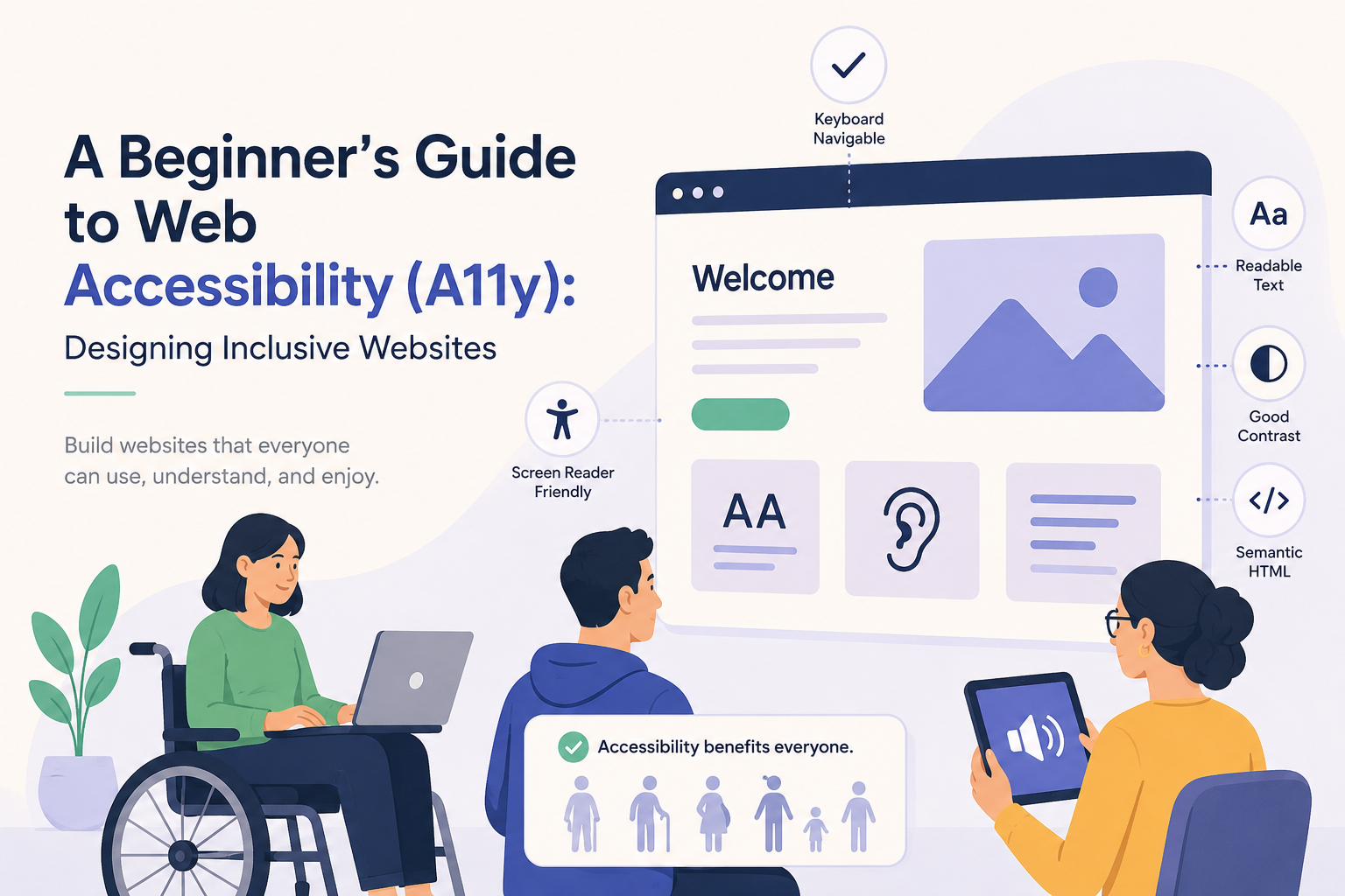
A Beginner’s Guide to
Web Accessibility (A11y)
for Inclusive Design
Imagine trying to shop online, but you can’t see the product images. Or you need to fill out a form, but your hands can’t use a mouse. For millions of people with disabilities, these obstacles are part of everyday digital life. Web accessibility—often shortened to A11y (a numeronym where the 11 letters between “a” and “y” are counted)—is the practice of making websites usable by everyone, regardless of their abilities.
In this guide, you’ll learn what accessibility in web development really means, why it matters, and how you can start building websites that work for all users. Whether you’re a student, a designer, or a developer, these practical steps will help you create a more inclusive web.
1
What Is Accessibility in Web Development?
Web accessibility means designing and coding websites so that people with disabilities can perceive, understand, navigate, and interact with them. It also benefits people without disabilities, such as those using mobile devices in bright sunlight, someone with a temporary injury, or older adults with changing vision.
Accessibility covers a wide range of conditions and is built on the idea that the web should be barrier-free. When a site is built accessibly, it works seamlessly with assistive technologies—tools like screen readers (which read out the content), screen magnifiers, voice recognition software, and special keyboards.
Think of accessibility not as an add-on, but as a fundamental part of good web development.
2
Why Accessibility Matters
Accessibility matters for three major reasons: ethical, legal, and business.
- It’s the right thing to do. The web is an essential resource for education, employment, healthcare, and social connection. Excluding people with disabilities means denying them equal access.
- It’s often required by law. Many countries have regulations that mandate accessible websites. For example, In the United States, the ADA has increasingly been interpreted to apply to websites, and WCAG is commonly used as the benchmark for compliance.
- It expands your audience. Over 1 billion people worldwide have some form of disability. An inaccessible website shuts out a huge group of potential users and customers.
When you build with accessibility in mind, you’re not just following rules—you’re making the internet better for everyone.
3
Benefits of Accessible Websites
Beyond inclusion, accessible websites bring real, measurable advantages.
- Better search engine optimization (SEO). Search engines love clean, semantic code and meaningful text alternatives—exactly what accessibility requires. Good heading structures, alt text, and clear link descriptions help your pages rank higher.
- Improved mobile experience. Accessibility practices like touch-friendly button sizes, clear color contrast, and keyboard-friendly navigation also make sites easier to use on phones and tablets.
- Increased usability for all. Captions help people watching a video in a noisy café. High contrast text benefits anyone using a screen in bright sunlight. Accessible forms reduce errors for every user.
- Stronger brand reputation. Showing that you care about all users builds trust and loyalty.
- Future-proofing your code. Accessible, standards-compliant code tends to be more maintainable and works better across different browsers and devices.
Simply put, accessible website design is good design.
4
Types of Disabilities Accessibility Supports
Understanding the different ways people interact with the web helps you address their needs. The four main categories are:
Visual Impairments
This includes blindness, low vision, and color blindness. Users might rely on screen readers that turn text and image descriptions into speech or braille. Others use screen magnification or high-contrast mode. Accessible design ensures that information is not conveyed solely by color and that images have descriptive alt text.
Hearing Impairments
People who are deaf or hard of hearing need visual alternatives to audio content. This means adding captions to videos and providing transcripts for podcasts. Without them, audio and video content becomes inaccessible.
Motor Disabilities
Some users cannot use a mouse due to conditions like paralysis, tremors, or repetitive strain injury. They might navigate entirely by keyboard, or use switch devices, eye-tracking systems, or speech recognition software. Your site must be fully keyboard accessible, with visible focus indicators and large clickable areas.
Cognitive Disabilities
This category includes learning disabilities, attention disorders, memory issues, and more. Accessible design supports these users through consistent navigation, clear and simple language, predictable layouts, and helpful error messages. Avoiding auto-playing media and giving users enough time to read content are also essential.
5
Key Accessibility Principles (POUR)
The Web Content Accessibility Guidelines (WCAG) are built around four core principles, known as POUR. Every accessible website should be:
- Provide text alternatives for non-text content (e.g., alt text for images, transcripts for audio).
- Offer captions and audio descriptions for video.
- Ensure content is adaptable and doesn’t rely on a single sense, like sight alone.
- All functionality must be available from a keyboard (no mouse-only actions).
- Give users enough time to read and use content.
- Avoid designing content that could cause seizures (e.g., flashing animations).
- Provide ways to help users navigate, such as clear headings and skip links.
- Use plain, readable language.
- Make web pages appear and operate in predictable ways—consistent navigation, no unexpected pop-ups.
- Help users avoid and correct mistakes with clear error messages and labels.
- Write clean, standards-compliant HTML.
- Use proper semantic elements so that browsers and assistive tools can reliably understand the page structure.
These POUR principles form the foundation of all accessible web development.
6
Important Accessibility Best Practices
• Semantic HTML • Alt Text for Images • Keyboard Navigation • Focus Management (NEW) • Color Contrast • Form Labels • Accessible Links and Buttons • Video Captions and Transcripts
Let’s turn theory into action. Here are the most impactful practices you can start using today.
Semantic HTML
Use HTML elements for their intended purpose. Headings (<h1>–<h6>) create a document outline that screen readers can skim. Use <nav> for navigation, <main> for primary content, <button> for buttons, and <a> for links. This gives meaning to your structure without extra effort.
Actionable Tip: Never choose an HTML tag just because of how it looks. Style with CSS instead.
Alt Text for Images
Every meaningful image needs alternative text that describes its purpose or content. For decorative images, use an empty alt attribute (alt=””) so screen readers skip them.
- Bad: alt=”image1.jpg”
- Good: alt=”A golden retriever puppy playing with a red ball in the park”
- Decorative: alt=””
Ask yourself: if the image disappeared, what text would convey the same information?
Keyboard Navigation
Many assistive technologies rely on keyboard-only input. Ensure you can reach and use every link, button, form field, and interactive element using just the Tab key. Pay attention to the focus indicator—the visual outline showing which element is active. Never remove it with outline: none unless you provide a custom, highly visible alternative.
Actionable Tip: Add a “skip to main content” link at the very top of your pages so keyboard users can bypass repetitive navigation menus.
Touch Target Size
Users should be able to easily activate buttons, links, checkboxes, and other interactive controls on touch-screen devices. Small touch targets can be difficult to select accurately, especially for users with motor impairments, tremors, limited dexterity, or those using a device with one hand.
WCAG 2.2 includes guidance on target size to help ensure interactive elements are large enough to be activated without accidentally selecting nearby controls.
Best practices include:
- Make buttons and interactive controls large enough to tap comfortably.
- Provide adequate spacing between adjacent interactive elements.
- Avoid placing small links too close together.
- Ensure touch targets remain usable across different screen sizes and orientations.
Actionable Tip: Test your website on a mobile device and verify that buttons, links, and form controls can be activated easily without zooming or repeated tapping.
Focus Management NEW
Keyboard accessibility is not just about allowing users to move through a page with the Tab key. Modern websites often contain dynamic components such as modal dialogs, dropdown menus, accordions, notifications, and single-page application (SPA) interfaces that update content without reloading the page. In these situations, proper focus management is essential.
Focus management ensures that keyboard and assistive technology users always know where they are on the page and can continue interacting with content efficiently.
For example, when a user opens a modal dialog, keyboard focus should automatically move to the dialog so they can interact with it immediately. When the dialog is closed, focus should return to the element that opened it. Similarly, when navigation menus, dropdowns, or other interactive components expand, focus should move logically to the newly available content.
Poor focus management can confuse users, cause them to lose their place, or make important content inaccessible.
Common focus management best practices include:
- Move focus to newly displayed content when appropriate, such as modal windows and pop-ups.
- Return focus to the triggering element when temporary content is closed.
- Ensure keyboard users can navigate all interactive elements within dialogs and menus.
- Avoid unexpected focus changes that can disorient users.
- Notify assistive technologies when dynamic content updates occur.
Actionable Tip: Test interactive components such as modals, dropdowns, and forms using only your keyboard. After every interaction, verify that focus moves logically and remains visible to the user.
Color Contrast
Text must have enough contrast against its background so that people with low vision or color blindness can read it. The minimum contrast ratio for normal text is 4.5:1, and for Large text is defined by WCAG as 18pt (about 24px) regular text or 14pt (about 18.66px) bold text. it’s 3:1. Use tools like the WebAIM Contrast Checker to test your color combinations.
Never use color as the only way to convey information. For example, don’t just mark required fields with red—add an asterisk and the word “required” as well.
Form Labels
Every form input should have a visible label connected using the <label> element. Placeholder text alone is not enough—it disappears as soon as the user starts typing.
<label for="email">Email address</label>
<input type="email" id="email" name="email">
Provide clear error messages that explain what went wrong and how to fix it.
Accessible Links and Buttons
Link text should describe the destination clearly. Avoid “click here” or “read more” out of context. Buttons should use the <button> element—never a <div> or <span> styled to look like a button, as these are not keyboard-focusable by default and lack built-in semantics.
- Bad: Click here to download the report.
- Good: Download the annual report (PDF)
Video Captions and Transcripts
All video content should include captions for people who are deaf or hard of hearing. Transcripts can benefit deaf, hard-of-hearing, and blind users when they include both spoken content and relevant descriptions of important visual information. Many platforms like YouTube offer automatic captioning, but always review and edit them for accuracy.
7
Common Accessibility Mistakes to Avoid
Even well-meaning projects can fall into these traps. Watch out for:
- Missing alt text on informative images.
- Low contrast text that fails the 4.5:1 ratio.
- Mouse-only interactions, such as dropdown menus that only open on hover without a keyboard equivalent.
- Empty links or buttons (e.g., social media icons without accessible names).
- Using color alone to indicate errors, selection, or emphasis.
- Unlabeled form fields that leave screen reader users guessing.
- Auto-playing audio or video, which can disorient users.
- Removing the focus outline without providing a replacement.
- Complex CAPTCHAs without an accessible alternative.
- Ignoring users’ prefers-reduced-motion settings or using excessive animations that may trigger vestibular disorders, dizziness, or motion sensitivity.
- Use headings in a logical structure. Avoid skipping levels when it causes confusion about the content hierarchy.
8
Accessibility Testing Tools and Resources
Testing doesn’t require expensive equipment. Here are free, reliable tools to start with:
- WAVE (Web Accessibility Evaluation Tool): A browser extension that highlights errors and potential problems directly on your page.
- Lighthouse: Built into Chrome DevTools, it runs an accessibility audit and gives a score along with actionable tips.
- Axe DevTools: A powerful extension for Chrome and Firefox that detects violations and explains how to fix them.
- Color Contrast Analyzers: The WebAIM contrast checker or the Colour Contrast Analyzer app let you test color combinations.
- Screen Readers: Try the free NVDA (Windows) or the built-in VoiceOver (Mac) to experience your site the way a blind user would.
- Keyboard Testing: Simply unplug your mouse and try to complete common tasks using only the keyboard.
No automated tool can catch everything. Manual testing with a keyboard and a screen reader is irreplaceable.
9
WCAG Guidelines Overview
The Web Content Accessibility Guidelines (WCAG) are the globally recognized standard for web accessibility, published by the World Wide Web Consortium (W3C). The current version is WCAG 2.2, but WCAG 2.1 is still widely referenced.
WCAG organizes its criteria into three levels of conformance:
- Level A: The most basic web accessibility features. Failure here means that some users will find your site impossible to use.
- Level AA: Deals with the biggest and most common barriers for disabled users. Many laws, regulations, and procurement requirements reference WCAG Level AA as the target level of conformance.
- Level AAA: The highest standard, covering more advanced and often ideal scenarios. It’s not always achievable for all content.
The guidelines are structured around the POUR principles. While the full document can seem overwhelming, you don’t need to memorize it. Start by applying the best practices in this article, and you’ll already be meeting many Level A and AA criteria.
10
Accessibility Checklist for Developers
Bookmark this quick checklist and use it before every launch:
- All meaningful images have descriptive alt text; decorative images use alt=””.
- Every interactive element is reachable and usable with the keyboard alone.
- A visible focus indicator is present on all focusable elements.
- Color contrast ratios meet at least WCAG AA (4.5:1 for normal text).
- Information is never conveyed by color alone.
- Forms have properly associated <label> elements and clear error messages.
- Videos include accurate captions, and audio content has transcripts.
- Page structure uses a logical heading hierarchy (h1, h2, h3…).
- Links and buttons have clear, descriptive text.
- The site includes a “skip to main content” link at the top of the page.
- The page has a unique, descriptive <title>.
- You’ve tested with a screen reader and keyboard navigation.
- ARIA (Accessible Rich Internet Applications) attributes can improve accessibility for complex interfaces, but native HTML elements should always be preferred when possible.
Frequently Asked Questions about Web Accessibility
A11y is a shorthand for “accessibility.” It’s a numeronym where the first and last letters (“a” and “y”) stay the same, and the middle 11 letters are replaced by the number 11. You’ll see it used often in developer communities and social media hashtags.
No. While it’s designed to remove barriers for people with disabilities, accessible websites improve the experience for everyone. For example, captions help non-native speakers, high contrast helps mobile users in sunlight, and keyboard navigation benefits power users who prefer shortcuts.
These are conformance levels of the Web Content Accessibility Guidelines. Level A covers the most basic requirements. Level AA addresses the most common accessibility barriers and is the standard most organizations aim for. Level AAA is the strictest and often ideal, but it’s not always possible to meet for all content.
Integrating accessibility from the start usually costs very little—often nothing extra if you adopt semantic HTML and best practices early. Retrofitting an inaccessible site can be expensive and time-consuming. Making accessibility part of your regular workflow is the most cost-effective approach.
Start with automated tools like WAVE or Lighthouse to catch obvious issues. Then perform manual testing: navigate your entire site with only a keyboard, and try it with a screen reader (like NVDA on Windows or VoiceOver on Mac). Finally, involve real users with disabilities if possible; no tool replaces real human feedback.
Absolutely. Search engines value many of the same things that accessibility requires: descriptive alt text, proper heading structures, readable content, and clean code. An accessible website often ranks higher in search results as a natural side effect.
Conclusion: Build a Web That Welcomes Everyone
Web accessibility isn’t a niche requirement or a box to check at the end of a project. It’s a mindset that values every visitor and recognizes the diverse ways people interact with the digital world. By implementing the practices in this guide—from semantic HTML and alt text to keyboard navigation and contrast testing—you take meaningful steps toward an inclusive internet.
Start small. Pick one improvement today: add proper labels to a form, fix a color contrast issue, or navigate your site without a mouse. Each fix makes a real difference in someone’s ability to access information, connect with others, or accomplish a task independently.
The web was designed to be universal. Let’s keep it that way. Build with empathy, test with real tools, and never underestimate the power of an accessible website to change a life.