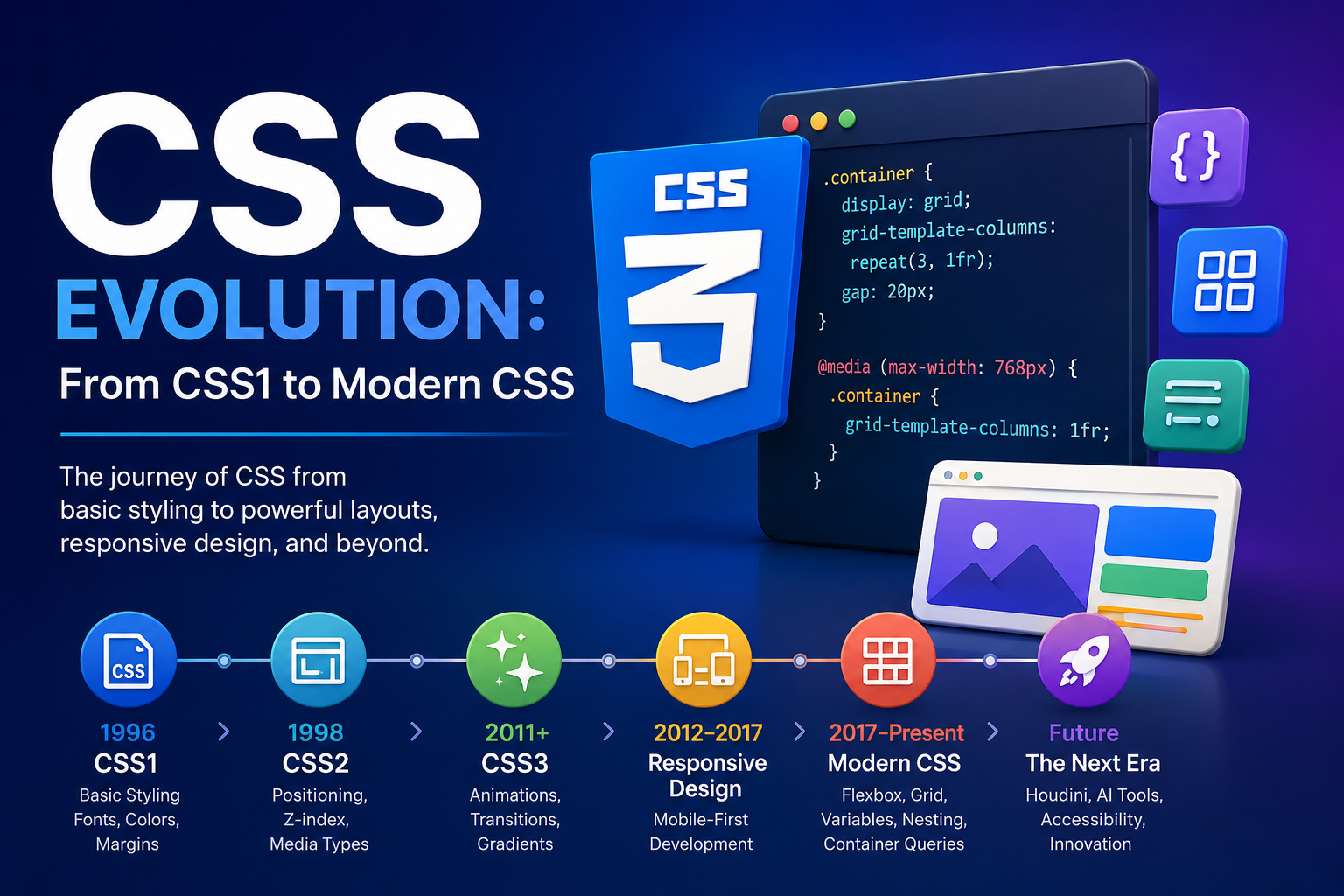
CSS Evolution: From CSS1 to Modern CSS
The journey of web layouts, styling milestones, and modern presentation frameworks.
Introduction
Imagine building a house where every room must be painted, decorated, and arranged individually. If you wanted to change the color of all the rooms, you would have to repaint each one manually. Early web development worked in a similar way.
Before CSS existed, web pages relied heavily on HTML for both content and presentation. This made websites difficult to maintain, inconsistent across pages, and hard to update.
The CSS Evolution journey—from CSS1 in 1996 to today’s advanced layout systems and responsive design capabilities—has transformed how developers and designers create websites. Modern CSS enables beautiful, accessible, responsive, and high-performance user experiences with significantly less code than ever before.
In this article, you’ll learn:
- What CSS is
- Why CSS was created
- The history of CSS
- CSS1 vs CSS2 vs CSS3
- Modern CSS features
- CSS Grid and Flexbox
- Responsive Web Design
- CSS frameworks
- The future of CSS
Whether you’re a beginner or an experienced developer, understanding the evolution of CSS helps you write better code and build better websites.
What is CSS?
CSS is a stylesheet language used to describe the appearance and layout of HTML documents. The core philosophy behind CSS is the separation of concerns: HTML defines the structure of a webpage, while CSS defines its visual presentation (colors, fonts, spacing, and layout).
HTML Example
<h1>Hello World</h1>CSS Example
h1 {
  color: blue;
  font-size: 36px;
}
HTML vs CSS
| Feature | HTML | CSS |
|---|---|---|
| Purpose | Defines content & structure | Defines design & appearance |
| Mechanics | Uses tags | Uses selectors |
| Role | Handles semantics | Handles styling |
Benefits of CSS
- Separates content from presentation
- Improves maintainability
- Reduces code duplication
- Enhances website performance
- Supports responsive design
For beginners learning web development, CSS is the tool that turns plain content into visually appealing websites.
Why Was CSS Created?
In the early days of the web, developers relied on HTML attributes like <font color="red"> for styling. This approach created significant problems:
<font color="red">Welcome</font>
- Difficult Maintenance: Updating styles required editing every single page individually.
- Code Bloat: Styling code was repeated everywhere, making pages heavy and slow.
- Browser Inconsistencies: Different browsers rendered proprietary tags unpredictably.
- Poor Scalability: Large websites became increasingly difficult to manage.
To solve these issues, the World Wide Web Consortium (W3C) introduced CSS to formally separate content from presentation—one of the most important milestones in web development history.
CSS Evolution Timeline
The development of CSS has been a continuous adaptation to new technologies and user expectations.
| Year | Milestone | Key Contributions |
|---|---|---|
| 1996 | CSS1 | Basic styling (fonts, colors, margins) |
| 1998 | CSS2 | Positioning, media types, Z-index |
| 2011+ | CSS3 | Modular architecture, animations, gradients |
| 2017+ | Modern CSS | Flexbox, Grid, Variables, Nesting, Container Queries |
1. CSS1 (1996) – The Foundation
CSS1 introduced the first standardized system for web styling. While its layout control was limited, it established the box model—the fundamental concept of margins, borders, and padding.
Key Features
- Font properties
- Text formatting
- Colors & Backgrounds
- Margins & Padding
- Borders
Example
body {
  font-family: Arial, sans-serif;
  color: black;
}

h1 {
  color: blue;
}
Advantages & Limitations
| Advantages | Limitations |
|---|---|
| Consistent styling & reusable stylesheets | Limited structural layout control |
| Reduced HTML markup clutter | No advanced element positioning options |
| Standard core visual definitions | Minimal browser support initially |
2. CSS2 (1998) – Structural Control
CSS2 added sophisticated layout capabilities, such as absolute, relative, and fixed positioning. It also introduced media types, allowing developers to create print-friendly styles for the first time.
Major Structural Features
Positioning
.box {
  position: absolute;
  top: 50px;
  left: 100px;
}
Z-Index Control
.modal {
  z-index: 999;
}
Media Types
@media print {
  body {
    color: black;
  }
}
Benefits
- More sophisticated designs with layered web interfaces.
- Print-friendly layouts and custom media stylesheet sheets.
- Improved structural accessibility options.
3. CSS3 – The Modular Revolution
CSS3 shifted the language from a single monolithic specification to independent modules. This allowed for rapid innovation in native features without rewriting the entire standard core layout.
- Visual Effects: Border radius, box shadows, and gradients eliminated the need for heavy image-based design tricks.
- Motion Styling: Native transitions and keyframe animations replaced the need for external plugins like Flash.
Advanced Selectors
input[type="email"] {
  border: 1px solid gray;
}
Visual Enhancements Showcase
Border Radius:
.card { border-radius: 12px; }Shadows:
.card { box-shadow: 0 4px 10px rgba(0,0,0,0.2); }
h1 { text-shadow: 2px 2px 5px gray; }
Animations & Transitions
@keyframes fadeIn {
  from { opacity: 0; }
  to { opacity: 1; }
}

.box {
  animation: fadeIn 1s ease;
}

button {
  transition: background-color 0.3s;
}
button:hover {
  background-color: blue;
}
Gradients
.hero {
  background: linear-gradient(to right, #0077ff, #00c6ff);
}
Responsive Web Design
As mobile devices became dominant, the web required a shift in strategy. Responsive Web Design (RWD), powered by CSS media queries, allowed websites to adapt gracefully to any viewport screen size.
Media Queries Code block
@media (max-width: 768px) {
  .container {
    width: 100%;
  }
}
Benefits of RWD
- Better global user experience
- Improved SEO discovery ranks
- Faster loading times
- Consistent brand styling
Modern CSS Features: The Game Changers
Modern CSS is far more powerful than its predecessors, allowing developers to create complex applications with significantly less code framework bloat.
Flexbox (One-Dimensional Layouts)
Ideal for distributing space and aligning elements dynamically along a single axis layout (e.g., navbars, components).
.container {
  display: flex;
  justify-content: center;
  align-items: center;
}
Real-World Use Cases: Navigation bars, cards, form inputs, dynamic align menus.
CSS Grid (Two-Dimensional Layouts)
A comprehensive grid layout system designed for complex, page-level structural matrices.
.container {
  display: grid;
  grid-template-columns: repeat(3, 1fr);
  gap: 20px;
}
CSS Grid vs Flexbox
| Feature | Grid | Flexbox |
|---|---|---|
| Dimensions | Two-dimensional (Rows & Columns) | One-dimensional (Row OR Column) |
| Layout Control | High Page Architecture Control | Medium Component Distribution Control |
| Best For | Full-page major structure layout | Component design, item alignments |
CSS Variables (Custom Properties)
Enables dynamic, centralized theme tokens and reusable dynamic declarations.
:root {
  --primary-color: #0077ff;
}

button {
  background: var(--primary-color);
}
Container Queries
The next step beyond responsive breakpoints, allowing specific components to adapt directly to their parent container sizing instead of the browser width.
@container (min-width: 500px) {
  .card {
    display: flex;
  }
}
Logical Properties & Advanced Organization
/* Logical Properties for internationalization writing directions */
.card {
  margin-inline: 20px;
}

/* Native CSS Nesting */
.card {
  padding: 20px;
  h2 {
    color: blue;
  }
}

/* Cascade Layers control structure overrides explicitely */
@layer base, components, utilities;
Advanced Modern Selectors
/* :is() matches group selectors efficiently */
:is(h1, h2, h3) { color: navy; }

/* :where() functions identically but nullifies specificity */
:where(section p) { margin-bottom: 1rem; }

/* :has() relational structural parent selector */
.card:has(img) { padding: 20px; }
CSS Frameworks and Their Impact
Frameworks accelerated frontend product delivery workflows dramatically:
- Bootstrap: Popularized early fluid responsive layouts with extensive preset layout elements.
- Tailwind CSS: Optimized engine focusing on highly efficient Atomic/Utility classes.
- Foundation: Comprehensive enterprise-grade layouts following structural best practices.
CSS Evolution Timeline Infographic
A visual summary mapping the milestones of CSS styles architecture across generations.
Challenges CSS Solved Over the Years
- Browser Compatibility: Standardization engine efforts reduced cross-platform compilation anomalies.
- Layout Problems: Grid and Flexbox layouts completely removed legacy structural hack habits (like floats).
- Performance Optimization: Advanced native attributes rendering styles dramatically minimize image assets and tracking script loads.
Best Practices for Modern CSS Development
- Use Mobile-First Design: Start with small viewport limits and scale upward progressively.
- Follow Semantic Naming: Prefer clear semantic context descriptions (
.product-card) over arbitrary values (.blue-box). - Leverage System Variables: Keep typography colors, themes tokens centralized within root properties.
- Maintain Structural Accessibility: Ensure appropriate background color element ratios match WCAG targets.
Common Beginner Mistakes & Solutions
| Mistake | Solution |
|---|---|
Overusing !important rules |
Restructure selector paths and specificity hierarchy |
| Applying fixed widths everywhere | Prefer responsive percentage values or relative system units |
| Ignoring structural accessibility factors | Implement comprehensive color validation checks |
| Writing deeply nested stylesheets | Maintain shallow, logical specificity styles paths |
Frequently Asked Questions (FAQ)
1. What is CSS evolution?
CSS evolution refers to the progression of CSS from CSS1 in 1996 to today’s advanced styling technologies such as Grid, Flexbox, Variables, and Container Queries.
2. What is the difference between CSS2 and CSS3?
CSS2 focused on positioning and layout improvements, while CSS3 introduced modules, animations, gradients, shadows, and modern selectors.
3. Which is better: CSS Grid or Flexbox?
Neither is universally better. Grid is ideal for two-dimensional layouts, while Flexbox excels at one-dimensional alignment.
4. What is Responsive Web Design?
Responsive Web Design allows websites to adapt to different screen sizes using CSS techniques such as media queries.
Conclusion
The story of CSS Evolution is a story of continuous innovation. From the basic styling capabilities of CSS1 to the positioning improvements of CSS2, and from the revolutionary features of CSS3 to today’s powerful tools like Flexbox, CSS Grid, Variables, Nesting, and Container Queries, CSS has fundamentally changed how websites are built.
Understanding the history of CSS helps developers write cleaner, faster, and more maintainable code. As the web continues to evolve, CSS will remain one of the most important technologies in frontend development.
